Plotting methods
Here’s a guide to making several different charts for data visualisation, with example code.
The library that manages this is matplotlib:
from matplotlib import pyplot as plt
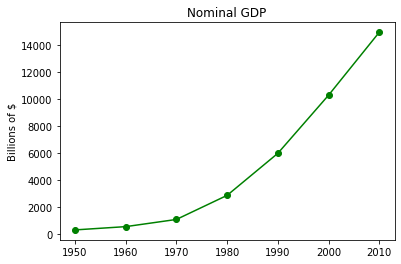
Linegraphs
years = [1950, 1960, 1970, 1980, 1990, 2000, 2010]
gdp = [300.2, 543.3, 1075.9, 2862.5, 5979.6, 10289.7, 14958.3]
plt.plot(years, gdp, color='green', marker='o',linestyle='solid')
plt.title("Nominal GDP")
plt.ylabel('Billions of $')
plt.show()
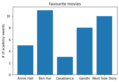
Bar Charts
movies = ["Annie Hall", "Ben-Hur", "Casablanca", "Gandhi", "West Side Story"]
num_oscars = [5, 11, 3, 8, 10]
plt.bar(range(len(movies)), num_oscars)
plt.title("Favourite movies")
plt.ylabel("# of academy awards")
plt.xticks(range(len(movies)), movies)
plt.show()
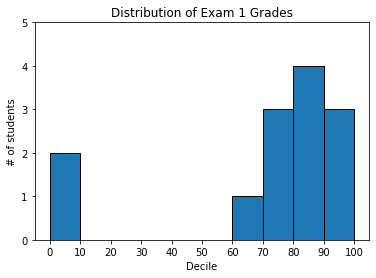
Histograms
from collections import Counter
grades = [83, 95, 91, 87, 70, 0, 85, 82, 100, 67, 73, 77, 0]
histogram = Counter(min(grade // 10 * 10, 90) for grade in grades)

plt.bar([x + 5 for x in histogram.keys()],
        histogram.values(),
        10,
        edgecolor=(0,0,0))

plt.axis([-5,105,0,5])

plt.xticks([10 * i for i in range(11)])
plt.xlabel("Decile")
plt.ylabel("# of students")

plt.title("Distribution of Exam 1 Grades")

plt.show()
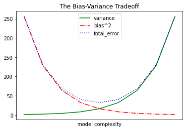
Line Charts
variance     = [1, 2, 4, 8, 16, 32, 64, 128, 256]
bias_squared = [256, 128, 64, 32, 16, 8, 4, 2, 1]
total_error = [x + y for x, y in zip(variance, bias_squared)]
xs = [i for i, _ in enumerate(variance)]

plt.plot(xs, variance, 'g-', label='variance')
plt.plot(xs, bias_squared, 'r-.', label='bias^2')
plt.plot(xs, total_error, 'b:', label='total_error')

plt.legend(loc=9)
plt.xlabel("model complexity")
plt.xticks([])
plt.title("The Bias-Variance Tradeoff")
plt.show()
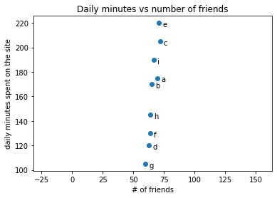
Scatterplots
friends = [ 70,  65,  72,  63,  71,  64,  60,  64,  67]
minutes = [175, 170, 205, 120, 220, 130, 105, 145, 190]
labels =  ['a', 'b', 'c', 'd', 'e', 'f', 'g', 'h', 'i']

plt.scatter(friends, minutes)

for label, friend_count, minute_count, in zip(labels, friends, minutes):
    plt.annotate(label,
                xy=(friend_count, minute_count),
                xytext=(5, -5),
                textcoords='offset points')

plt.title("Daily minutes vs number of friends")
plt.xlabel("# of friends")
plt.ylabel("daily minutes spent on the site")
plt.show()
And with equalised axes
plt.axis("equal")